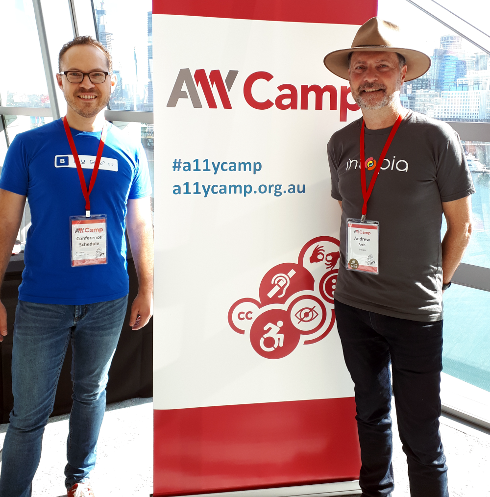
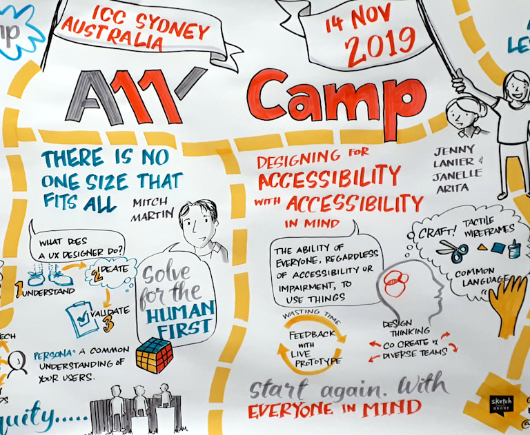
Last week, I attended my first ever A11y Camp, held in Sydney, Australia!
A11y Camp is an annual event about creating a digital world with no barriers, and is Australia's largest event for professionals interested in digital accessibility and inclusive design. It is run by A11y Bytes, a community of volunteers around Australia focused on raising the profile of digital accessibility and inclusive design.

There were many great speakers, and I couldn't possibly do any of them justice here on our blog. So I'm not going to try, nor am I going to talk about the many accessibility tips and guidelines you may have heard before.
In this post, I'm going to provide a mere snapshot of things that stood out for me, personally, and that I took away from the experience as a whole.
So here are my 5 takeaways.
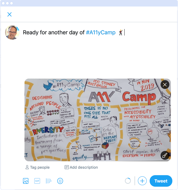
1. Add image descriptions to your tweets
One simple thing we can all do to be more inclusive in our online social communication is to add descriptions to the images we use in tweets. Without these, some people are only receiving half of your message.
This was mentioned several times over the two days, including by one very entertaining and insightful Scott Nixen, who rightly said, "If I can do it, so can you!"
Find out how to enable image descriptions for your tweets.

2. Use headings and use them well
I already knew this, but I didn't realize quite how much impact headings have on accessibility until it was explained in this way at A11y Camp, and in the week prior by Laurence Lewis at the Brisbane Web Accessibility & Inclusive Design meetup.
When reading a document, we don't always read it from top to bottom (unless, of course, it's a novel, and we don't want to spoil the ending). We scan it at a glance, paying particular attention to the headings, to determine whether the document is useful as a whole and, if so, which parts we want to read.
Headings enable users of screen readers to navigate content "at a glance" too.
So, remember, for headers to be useful when used in this way, they need to be used properly. They need to describe the sections they are heading clearly, and they need to be nested in rank order. That means you don't use a larger or smaller header level simply because you feel it looks better that way. This will interfere with screen reader flow. Use a level 3 header to represent a subsection within a level 2 header and so on. If it looks weird on your page, get your styles updated.
Check out the WAI tutorial about headings for more information.
3. Do your best
It's easy when working with accessibility to feel a little overwhelmed from time to time:
- There's no end to how much we need to do for accessibility?
- How can I possibly learn all there is to know about accessibility?
Yes, these are genuine thoughts and feelings that can surprise us, but there are a couple of things that are helpful to keep in mind.
One is to do your best. Belinda Dow is a Digital Accessibility Consultant at National Australia Bank, and she shared one of her favorite quotes:
Do the best you can until you know better. Then when you know better, do better.
And the other is...
4. It takes time and teamwork
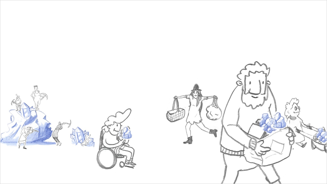
Maz Hermon is a UI implementation practice lead and front-end developer at Trade Me, and he compared working with web accessibility to trying to move a massive boulder. Basically, it takes time, and for all of us to work together on it, to make a difference.


Keynote speaker, Santiago Velasquez, also made an excellent (and entertaining) point that the people who need accessibility "have madass problem-solving skills" and are the best people to design for inclusion and accessibility.
So, keep working on accessibility and raising awareness in your organization, and think more about the value that diversity can bring.
5. Some simple a11y rules to live by
Finally, as I was winding down after a great two days of thought-provoking and inspiring talks, some high-level guiding thoughts kept popping into my head. And they can be articulated as a series of steps to take when approaching accessibility. In fact, they seem applicable to many of life's challenges. They're not profound. But I think they're important to remember.
- PANIC! No...don't.
- Seek to understand.
- Do your best.
- Repeat.
Where to from here?
Connect with me and Tiny on Twitter, and look out for the next A11y Camp or a11y meetup in your area.
And if you'd like to know more about how our WYSIWYG HTML editor can help you when it comes to accessible web content for your organization, contact us, and we can set up a call with you to discuss your requirements.
