It’s a marketer’s worst nightmare – you’ve spent months preparing for your big launch, everything’s ready to go, you hit send, and eagerly await signups… but, crickets. No, the response you hoped for didn’t come to fruition, but as you’re clearing the autoresponder messages, you notice something worse has happened. Your inbox is full of replies saying the email can’t be read 😱
Hopefully, this hasn’t happened to you. But if it has, you’re already familiar with the problem of emails not rendering properly across the many and varied email clients in the market. Fear not. This article explains why you need to pay attention to email rendering as well as the rules, tools and resources you need to ensure you never experience the same email doomsday scenario again.
What is email rendering?
Email rendering is the process of an email being displayed to its recipient when they open it in their email client. Emails are coded with HTML and CSS, which define the structure, content, and styling.
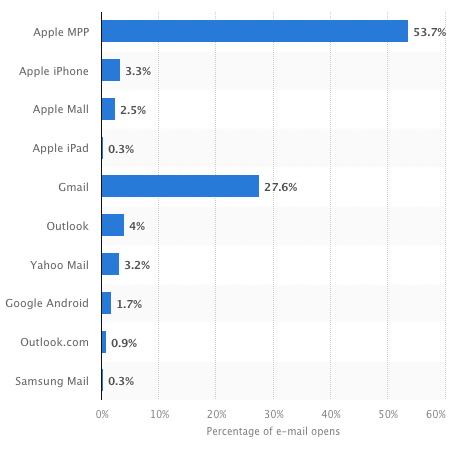
However, not all email clients (the app or website that people use to read their emails) are created the same, which can present issues when designing emails. Popular clients like Gmail, Outlook, and Apple Mail do not fully support HTML and CSS. Each of them render the code differently, which leads to inconsistencies in how the same email may appear across platforms.
With such a variety of email clients being used, and you not being aware of what email client your recipient is using, understanding how email rendering works is important, Especially if you’re looking to create emails that provide a consistent experience for your recipients.
Email rendering testing
Before we get into the rules, a quick note on email rendering testing. Even if you’ve followed best practices, you’ll want to test your emails thoroughly to ensure you haven’t missed anything.
You have a couple of options:
1. The old school way
Find a bunch of old laptops from your friends and family, install different versions of email clients on each one, and boot them all up each time you need to test an email.
If you have lots of space, patience and want to feel like Neo from The Matrix, this might be the right option. But if you’re like most people, there’s an easier method…
2. The modern way
SaaS tools like Litmus run tests for you across a full spectrum of popular desktop and mobile email clients. They run the tests instantly, and require no hardware purchases or extra space in your office.
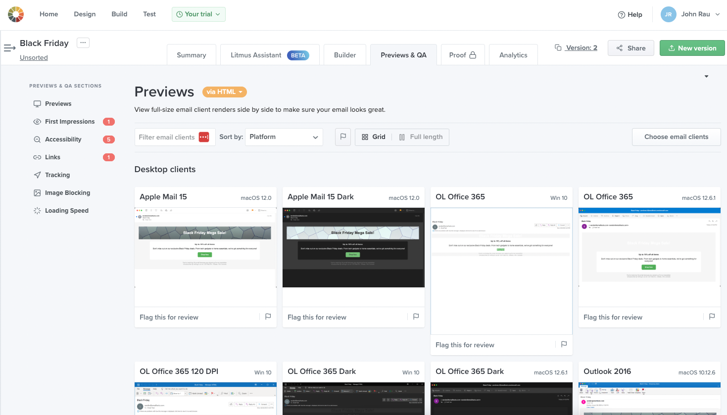
Whatever your weapon of choice, the words of wisdom here are test, test and test.
Comparing rendering across email clients
Using Litmus, we tested a sample Black Friday email across 3 popular email clients. Can you spot the differences?
Here’s the original email, loaded in a browser:

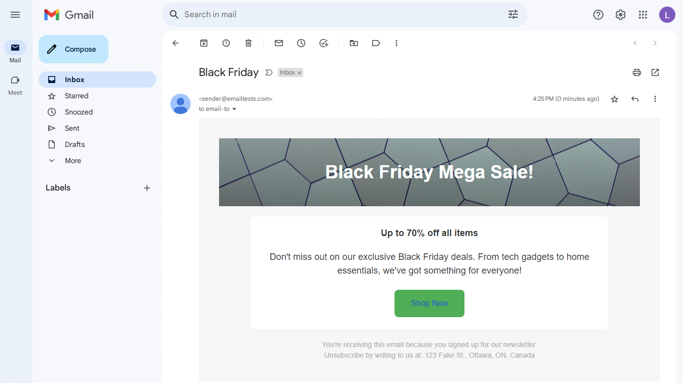
In Gmail, the link text is blue, which could be an issue if the button were blue.
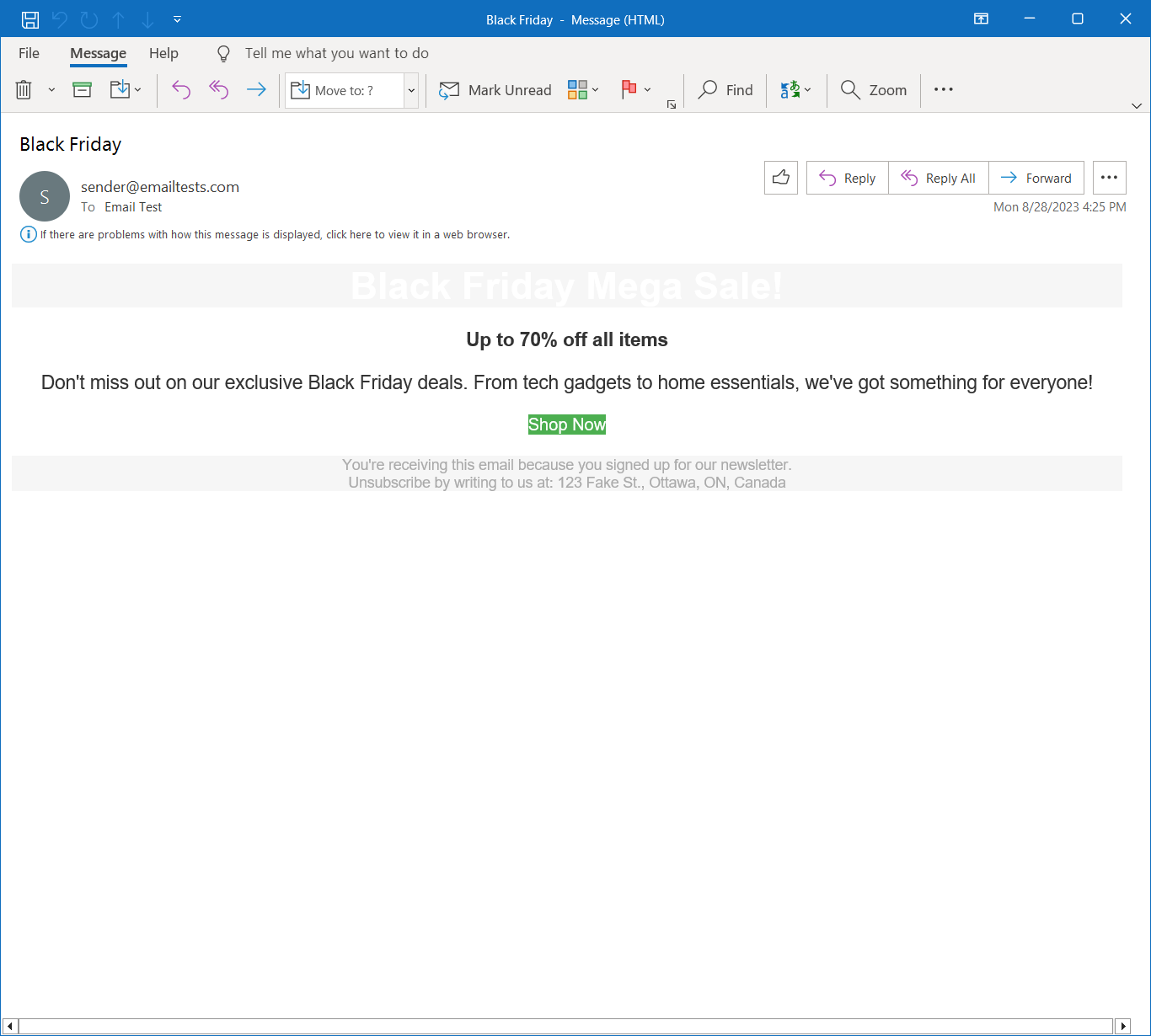
In Outlook, the email is far worse - note the missing background image, button styling and how the middle white section doesn’t follow a fixed width like the others. Yikes!
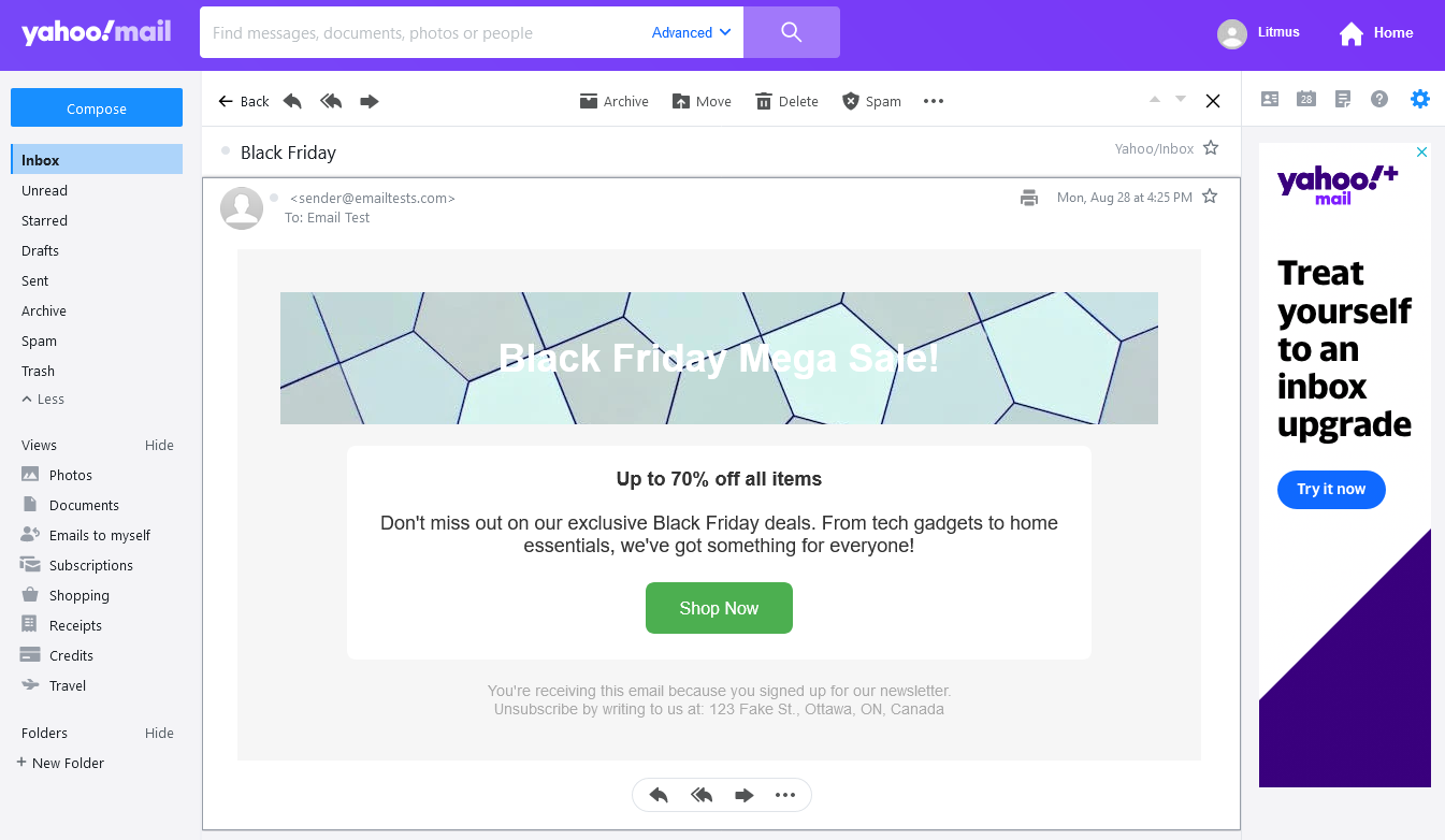
And finally, Yahoo! Mail. It doesn’t respect the CSS rule we put in to darken the header background image, so it’s very difficult to read the white heading.
Email rendering issues across clients
What do all those example render issues have in common? They each contain one or more issues that impact usability, accessibility, or brand experience.
The worst part is that these examples only scratch the surface. Other common email rendering issues include:
1. Inconsistent font display:
Different email clients can render fonts inconsistently, affecting readability and possibly accessibility.
2. Broken images:
Images may not load or display properly, reducing the visual impact of the email, and if alt text is present/loaded, then it also affects accessibility
3. Unresponsive layouts:
Emails may not adapt well to various screen sizes in different devices, causing layout issues.
4. Misaligned text and elements:
Text and design elements may not align as intended, disrupting the visual flow.
5. Background color issues:
Some email clients may not support background colors, affecting the email's aesthetics and potentially its accessibility.
6. HTML/CSS limitations:
Not all email clients fully support HTML and CSS, leading to simplified or broken layouts.
7. Text-only emails:
Some clients or settings may strip out all HTML, rendering just the plain text version.
8. Unplanned line breaks:
Unexpected line breaks can appear, affecting the readability and flow of text.
9. Improperly scaled images:
Images may appear too big or too small, disrupting the layout and user experience.
10. Lack of video support:
Embedded videos may not play, requiring alternative content solutions.
11. Emoji rendering:
Emojis may not display consistently across different email platforms, risking miscommunication.
12. Failing to load external CSS:
Some email clients won't load external stylesheets, affecting custom styling.
13. Button issues:
CTA buttons may not display as intended, hindering user engagement and potentially accessibility.
With all the work you put into crafting the perfect email, ensuring it gets through spam filters, and creating content for people to click through to, doesn’t it also make sense to make sure it renders correctly?
Best practices to ensure consistent email rendering
Follow these best practices to ensure your emails load consistently, every time:
- Use HTML tables to outline your design – for intricate designs, nested tables can come in handy
- Ensure your HTML code adheres to W3C standards
- Set your email width between 600 and 800 pixels for optimal visibility in most email client preview panes
- Refrain from using overly complicated CSS
- Inline your CSS inside HTML tags rather than loading it externally
- Utilize CSS media queries to ensure your email is responsive across various screen dimensions
- Stick to widely-used web fonts, such as Arial, Verdana, or Georgia, which are supported by most browsers and email applications
- Maintain readability by steering clear of hidden text or tiny font sizes
- As a fallback, include a plain text version of the email and link to a web page where recipients can view the email in their browser
These are the basic principles to follow, every time you produce an email. We also recommend checking out these additional technical resources, to avoid hidden landmines when coding your emails:
- HTML email cheat sheet by devhints.io – an up-to-date list of HTML properties and selectors to avoid
- CSS Support Guide for Email Clients by Campaign Monitor – HTML and CSS elements and properties, listed by email client
Building rendering best practices into your email design process
What if you and your fellow marketers didn’t have to worry about following many of these rules, and you could just focus on creating beautiful emails?
If you’re using TinyMCE as the rich text editor inside your email marketing app, you can rest assured that every line of code is standards-compliant code. To take things further, you can even configure TinyMCE to disallow HTML elements that aren’t email-friendly, use read-only merge tags, check for accessibility, and even generate CSS-inlined HTML on the fly.
Want to give it a try? Sign up for your free 14-day TinyMCE trial where you can test all our email-ready features inside your app.
Happy rendering!
