Emojis carry emotion, tone, and intent, often standing in for words entirely. Commonly used to add clarity, emojis can occasionally create confusion, and in some cases, actively harm accessibility. They're not interpreted the same way by all users or all technologies.
Understandably, most developers and product managers don’t focus on what kind of emojis an embedded rich text editor (RTE) provides in their application. Different RTEs handle emojis differently. Some editors strip accessibility metadata, while others allow authors to override emoji descriptions, mark symbols as decorative, or add custom aria-label attributes. All of this must be considered when you’re selecting the right RTE for your application.
What is accessible content?
Accessible content is digital material designed so all users, including people with disabilities, can perceive, understand, navigate, and interact with it. Accessibility isn't a fringe concern. Inclusive design is essential. When you’re addressing emoji accessibility in your app, you’re supporting equitable communication. These recommendations align with WCAG 2.2, which emphasizes reducing cognitive load, ensuring meaningful non-text content, and supporting assistive technologies consistently across platforms.
Who is affected?
Globally, at least 2.2 billion people live with vision impairment. Many rely on screen readers, Braille displays, or other assistive technologies to navigate digital content.
But the group is far broader than that:
- People with cognitive disabilities.
- Neurodivergent users who experience sensory overload.
- Older adults with reduced contrast sensitivity.
- People reading on cracked screens or in bright sunlight.
- Anyone encountering emojis on unfamiliar platforms.
- Readers from low-context cultures.
All of these people may struggle with emojis used in non-accessible ways.
How images and emojis are made accessible
Screen readers interpret images through alt text, which provides a textual equivalent. Emojis also have "alt text," but theirs come from the Unicode description, a system name determined by the Emoji Subcommittee. This name isn't customizable by default and often doesn't match how people actually use the emoji.
For example:
- 💀 is read as "skull", but the popular euphemistic meaning is “dead from laughing.”
- 🔥 is read as "fire", but the popular meaning is “hot” as in amazing or well done.
Neither unicode description reflects the euphemistic meanings. This disconnect creates confusion and misinterpretation for blind and low-vision users.
To complicate things further, different platforms and operating systems render the same emoji differently. Apple, Google, Samsung, Microsoft, and social platforms each design their own versions. Slight expression changes can shift a symbol's emotional tone from friendly to sarcastic, or neutral to hostile.

The right WYSIWYG editor validates for alt text, and helps your users ensure their images and emojis are interpreted correctly by assistive technologies. It also helps you ensure the accessibility of your app's output.
How screen readers interpret emojis
Screen readers speak each emoji's Unicode name out loud. These names are defined by the Unicode Consortium, the governing body that standardizes how emojis are encoded and described across operating systems. Some are concise ("red heart"). Others are needlessly literal ("face with steam from nose"). And multi-emoji sequences (common in casual messaging) quickly become tedious or incomprehensible when spoken aloud:
"party popper, party popper, party popper"
instead of "🎉🎉🎉"
They also struggle with:
- Skin tone modifiers.
- Gender variants.
- Zero-width joiner sequences (e.g., family emojis).
- Newly released emojis not yet recognized by the screen reader.
Different assistive technologies handle emojis differently:
- Job Access With Speech (JAWS) may read compound emojis verbosely.
- NonVisual Desktop Access (NVDA) relies on underlying Windows APIs, which can lag behind updates.
- iOS’s VoiceOver handles many emojis well but reads sequences slowly.
- Android’s TalkBack can misinterpret skin tone variants.
Authors can't assume uniform behavior, which means that neither can you when you’re building an application that must handle emojis in the content.
What emojis look like with low vision
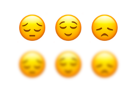
Some emojis are nearly indistinguishable even to fully sighted users on small screens. For someone with low vision, the "pensive," "relieved," and "disappointed" emojis collapse into nearly identical blurred shapes.

Color similarity makes interpretation even harder, especially for older adults or readers using dim mode. And for neurodivergent users, dense emoji strings spike cognitive load, making the message harder to process.
Cultural and contextual pitfalls with emoji
Emojis are not a universal language. Their meaning shifts across age groups, cultures, social groups, generational norms, and subcultures. For example:
- 🙏 may be prayer, gratitude, pleading, or a high-five depending on culture.
- 🙂 is friendly to some, passive-aggressive to others.
- ❤️ is affectionate in some regions and romantic in others.
Screen readers strip all that nuance away. When emojis carry the emotional weight of a message, many readers miss the intent entirely.
Best practices for emoji accessibility
Even with careful writing, accessibility often depends on the tool you use. Some rich text editors preserve ARIA markup and emoji metadata, while others sanitize or strip attributes entirely. You’ll need to be aware of how your app handles emojis.
1. Choose an RTE that already handles emojis
Emojis are often overlooked during development, even when accessibility is part of app requirements. If you're building an application, choose an RTE that supports accessibility features like alt text prompts, contrast checking, or semantic HTML output. Then users’ emoji output from your app will always be accessible.
2. Systematically check emoji descriptions and override them when possible
Sometimes the Unicode name aligns with your intention, but often it doesn't. When using custom HTML or a rich text editor with ARIA support or an Accessibility Checker, you can filter content for clearer alt text:
<span role="img" aria-label="celebration">🎉</span>
or mark decorative emojis as hidden:
<span aria-hidden="true">✨</span>
Not all publishing tools allow this level of control. Advanced rich text editors that support custom HTML or accessibility plugins make it easier to add ARIA labels or mark emojis as decorative.
3. Verify emojis against a resource like Emojipedia
If meaning is critical and your app really needs emoji support, verify the emoji across systems using resources like Emojipedia. A smiling face on one device may look smirky or even hostile on another, because emojis vary from platform to platform.
4. Limit ambiguous emojis in your app
Emojis with culturally loaded, sarcastic, or euphemistic meanings are fertile ground for misinterpretation and sometimes offense. When in doubt, limit your emoji library in your application so it doesn’t contain possibly offensive symbols.
5. Use an accessibility checker
You can help your users comply with WCAG emoji accessibility guidelines and you don’t have to build in checks for every possible user scenario. Use an RTE with an Accessibility Checker, which allows your users to run quick checks before publishing their content. If yo’ure using TinyMCE as your RTE, you can even set the strictness level for WCAG guidelines.
Are emojis accessible?
In most cases, emojis are only partially accessible. Screen readers can interpret them using Unicode names, but the spoken descriptions often fail to convey intended emotion, tone, or cultural meaning, which means emojis aren't reliably accessible across platforms, devices, or assistive technologies.
Wrap up
Emojis aren’t neutral; they’re powerful. When used without consideration, they can obscure meaning, fracture comprehension, and exclude readers who depend on assistive technology. The tools you use matter.
A rich text editor that preserves semantic HTML and accessibility markup gives your content a far better chance of being understood by assistive technologies, emojis included. If you want to try out an accessible rich text editor for yourself, sign up to get TinyMCE for free today.
