Looking for some creative inspiration to make your forms stand out?
Forms are an essential part of just about any interactive website or app, whether you have an inquiry form, content uploader, e-commerce checkout, or comment section. But with audiences exposed to more apps, brands, and marketing each day, many forms have lost their magic and become a tedious chore.
Here we go, time to enter my name, email, and payment info again… *yawn*
Savvy designers and developers realize that it doesn’t have to be that way. You can reclaim some of the fun and magic for users with a fancy, creative form design that helps make the experience more useful, engaging, and enjoyable. Plus a range of other benefits, too...
Why make your forms fancy
When you upgrade your forms to something a bit more fancy and creative, you’re more likely to:
- Stay on brand - When you customize your form styling, you can use colors, shapes, and styles that fit your branding (and the rest of your site).
- Modernize your look - Banish the old school drab gray colors and straight lines and give your forms a modern makeover.
- Get attention - When your audience is overwhelmed with content, brands, and ads coming at them from all directions, doing something different with your forms will mean more people pay attention and talk about you.
- Boost conversions - When your forms are more fun and enjoyable to complete, more people are going to finish them.
- Surprise and delight - Adding little details (like hiding an Easter egg) can bring an element of surprise and delight to the brand experience and make your customer or user smile.
Get the basics right first
Before you get fancy, you should always make sure you follow form design best practices, like:
- Accessibility
- Mobile responsiveness
- UX best practices
But if you’ve got a simple form that ticks all the boxes and works well, but you want to improve conversions, make it more on-brand, or attract attention, it’s time to try adding in fancy elements.
Fancy form elements with Aaron Iker
Aaron is a UI designer and front-end developer based in Germany who likes to create clean and user-friendly interfaces. He often uses the GreenSock library to create JavaScript animations and custom styled forms with modern CSS.
Aaron’s previously shared that it’s now easier than ever to build custom form elements like checkboxes, buttons, and toggle switches:
The reason is that we can finally style the ::before and ::after pseudo-elements on the <input> tag itself. This means we can keep and style an <input> and won’t need any extra elements. Before, we had to rely on the likes of an extra <div> or <span>, to pull off a custom design.
Form element inspiration
The best place to start when fancifying your forms is to get some inspiration. You might already have a swipe file of UI design inspiration somewhere. But if not, start with Aaron Iker’s styled buttons and other fancy form elements.
Here are some of our favorite animated form elements from Aaron:
Submit/confirm buttons
Paper plane button (v2)
— Aaron Iker (@aaroniker_me) June 4, 2020
On @CodePen https://t.co/XRt1W0blxt
Using @greensock pic.twitter.com/Sy63d7GMg7
🎉 Button (v2)
— Aaron Iker (@aaroniker_me) April 23, 2020
Improved the confetti for example (Using @greensock).@CodePen https://t.co/Y17ENa16gL pic.twitter.com/82Kjcyfy3E
Order confirm animation @CodePen https://t.co/pZIJyLVzZ5
— Aaron Iker (@aaroniker_me) January 17, 2020
Using @greensockhttps://t.co/oaON1RNqc1 pic.twitter.com/Nc1zQF72Jh
Order confirm animation #2 on @CodePen https://t.co/XHKcBSSWkE pic.twitter.com/B91XDFh3Cl
— Aaron Iker (@aaroniker_me) September 11, 2019
Checkboxes
Check@joincheck https://t.co/u8zpyg5MbT@CodePen https://t.co/K8OqlvpgsE pic.twitter.com/NfU1a1Y09A
— Aaron Iker (@aaroniker_me) July 6, 2020
Checkboxes on @CodePen https://t.co/RdhOa7QA7P
— Aaron Iker (@aaroniker_me) December 10, 2019
Concept @SMSeddy https://t.co/MdKwdme3XJ pic.twitter.com/QA8FYfyNrQ
Toggles
Egg Switch (CSS) on @CodePen https://t.co/u990vehNfohttps://t.co/j5O0c4myK4 pic.twitter.com/AAW3K7Y1AY
— Aaron Iker (@aaroniker_me) February 6, 2020
CSS ❤️ Switch on @CodePen https://t.co/GKijSGyNqJ
— Aaron Iker (@aaroniker_me) December 17, 2019
Concept by @torebernhoft https://t.co/HAX9qYCfb0 pic.twitter.com/NsD3rxUYxQ
Dropdown selections
Select dropdown on @CodePen https://t.co/GZ7qQIELn9https://t.co/MjLeW92PaH pic.twitter.com/oyJo8WGbAd
— Aaron Iker (@aaroniker_me) October 22, 2018
Multiple select animation on @CodePen https://t.co/1bIiTROMuU
— Aaron Iker (@aaroniker_me) September 6, 2018
Concept by @shakuro pic.twitter.com/wgEIe34gWe
Date selectors
Playful birthday input @CodePen https://t.co/WjM6rUC4ba
— Aaron Iker (@aaroniker_me) December 20, 2019
Shows the zodiac if month & day filled
Concept by @st8rmi https://t.co/6fWAgGKpvX pic.twitter.com/AppV1zDP83
Ratings
Rating@CodePen https://t.co/eqzDPzz3Mh
— Aaron Iker (@aaroniker_me) June 25, 2020
Using @greensock pic.twitter.com/ZeTWWu2FVR
⭐️ Rating on @CodePen https://t.co/Ui2tsr3vh4
— Aaron Iker (@aaroniker_me) September 19, 2019
Concept @Da_one_11 https://t.co/EecxLp5TLZ pic.twitter.com/FHXViP6Zfj
Sliders
Rubber slider (refactored w/o jQuery)
— Aaron Iker (@aaroniker_me) May 20, 2020
Using @greensock - concept @cuberto https://t.co/Lmg7VGpybQ pic.twitter.com/8T6nemZiy9
Smoke Slider 💨 on @CodePen https://t.co/peKAcukMOE
— Aaron Iker (@aaroniker_me) November 21, 2019
Concept by @cuberto - Using @greensock https://t.co/tmSq7KaKZj pic.twitter.com/C6x54gdTCb
Balloon Slider on @CodePen https://t.co/xqJeFk4flN
— Aaron Iker (@aaroniker_me) October 15, 2019
Concept by @cuberto - using @greensock easinghttps://t.co/XUlbsJWHMf pic.twitter.com/p1AvTtDkNY
Password validation
Password error animation on @CodePen https://t.co/I4gSSYm943https://t.co/xez4rDiuwy pic.twitter.com/VdhCSG6WNk
— Aaron Iker (@aaroniker_me) September 26, 2018
Password error animation on @CodePen https://t.co/QvdcEjD3q7
— Aaron Iker (@aaroniker_me) September 10, 2018
Inspired by @nguyenxuanhoan2 https://t.co/YbOEQZLtPT pic.twitter.com/56v7VPOZu8
Email validation
Email Validation @CodePen https://t.co/jI7lD18JPnhttps://t.co/vI3o3foi0U pic.twitter.com/hbBx1er9KE
— Aaron Iker (@aaroniker_me) February 19, 2020
Simple animation for an email input - on @CodePen https://t.co/J2yYp93cDU pic.twitter.com/hQS7RuNjyE
— Aaron Iker (@aaroniker_me) July 3, 2018
Text fields
Textfield animation on @CodePen https://t.co/uGt6jvocso
— Aaron Iker (@aaroniker_me) October 3, 2018
Concept by @Volorf https://t.co/oGSi7pLkuP pic.twitter.com/NuxM1Bn6f9
Input group with :focus-within pseudo class
— Aaron Iker (@aaroniker_me) August 15, 2019
On @CodePen https://t.co/IZFk9wgj1X
Widely supported https://t.co/aDkvfd3iOQ pic.twitter.com/Bq8265CARO
Uploaders
Upload buttons @CodePen https://t.co/WVq5v3GjMW
— Aaron Iker (@aaroniker_me) December 12, 2019
Using @greensock https://t.co/8nTzt9Qr0B pic.twitter.com/AZsaUdJhQE
Upload on @CodePen https://t.co/SZFIMeXArO
— Aaron Iker (@aaroniker_me) July 4, 2019
Concept by @Jakubantalik - using @Snapsvg https://t.co/WTjKe3qZ2s pic.twitter.com/m2HgkVCXa5
Drag & Drop upload @CodePen https://t.co/7Yzt9xQ6aS
— Aaron Iker (@aaroniker_me) July 1, 2019
Concept by @Jakubantalik - using @greensock https://t.co/ZUPGYYjQQo pic.twitter.com/qEj93qTODO
Progress checkmark on @CodePen https://t.co/qNpOR9sVXi
— Aaron Iker (@aaroniker_me) June 28, 2019
Based on drag & drop upload by @Jakubantalik https://t.co/NzYP3pufW4
(Will publish complete coded concept on monday 🙂) pic.twitter.com/K4hmI5QvFA
Loaders
Lightning bolt loader @CodePen https://t.co/dr4Dr0twsS
— Aaron Iker (@aaroniker_me) September 12, 2019
Playing around with @greensock (optimized Google Chrome)https://t.co/EWM4OlKfk4 pic.twitter.com/fj39Yr3FtE
Infinity Loader on @CodePen https://t.co/EsevGgEUUthttps://t.co/DYbK7qF0HC pic.twitter.com/et3vacyYoA
— Aaron Iker (@aaroniker_me) November 16, 2018
Looking for more inspiration? Check out more of Aaron’s work on Dribble or CodePen.
Enhance your forms with WYSIWYG editing

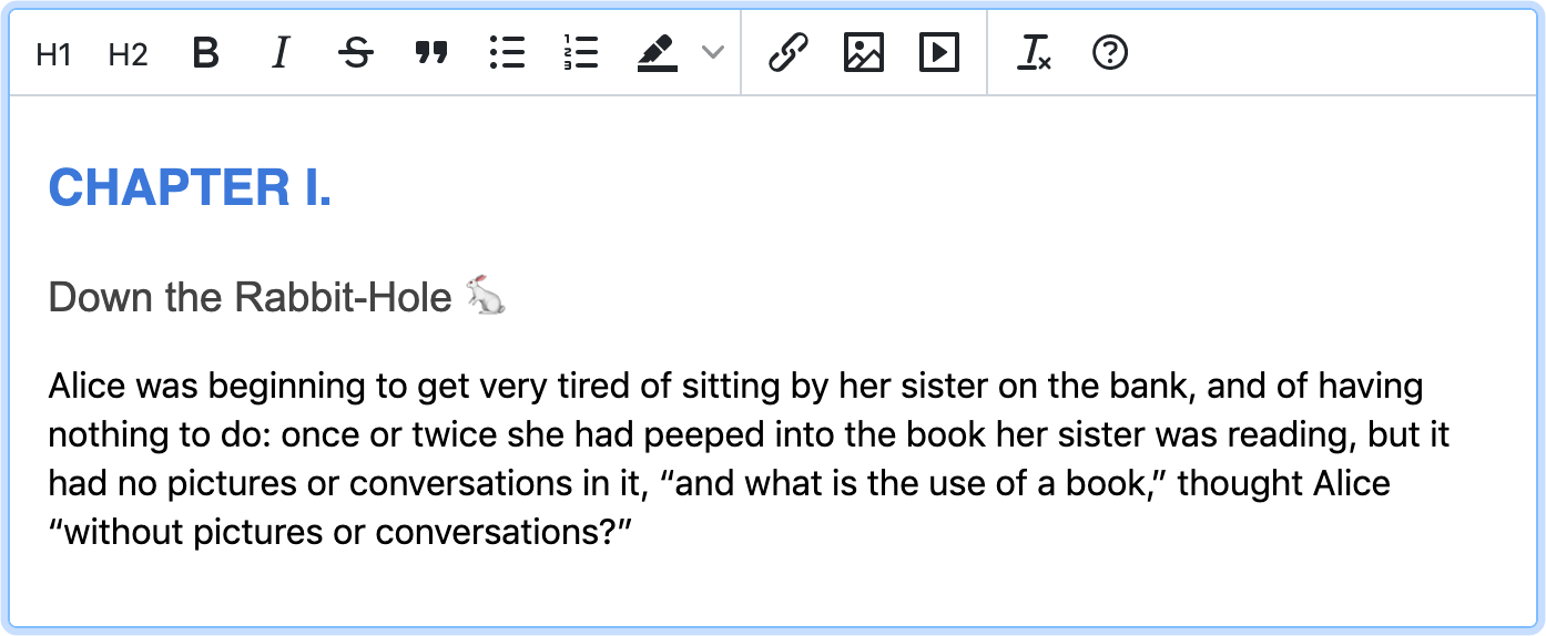
Add the TinyMCE WYSIWYG editor to your text fields and enable advanced text formatting so your users can style their form responses before submitting. This is ideal for detailed responses like describing an issue, submitting a forum post or guest blog post, embedding images, and other instances where advanced text formatting can be helpful.
Check out these articles for more information about how to integrate TinyMCE with your favorite frameworks:
- Enhance Bootstrap forms with WYSIWYG editing
- Enhance React forms with a rich text editor
- Create an Angular reactive form with a rich text editor
What are your favorite tips and tricks for making your forms fancy? Tag us on Twitter at @joinTiny and send us the link to a form design that you love!
