When you’re building a content creation application, it’s important to incorporate image handling, including easy image resizing, for your customers. You can’t escape the complexities of image handling, but you can seek out the right content creation component that makes mastering images easy for customers. So which components should you look for?
For a content creation experience, consider a WYSIWYG that’s designed to be easy to integrate. And one that gives your customers a familiar User Interface (UI). For mastering image handling, and image resizing with CSS and HTML, look no further than the TinyMCE rich text editor, with capabilities like the Enhanced Image Editing (Premium) plugin.
This post explores the image resizing abilities that TinyMCE unlocks for your content creation designs. Read on to find out how to resize images with CSS, and HTML, and more (like useful API methods) for precise image resizing.
Understanding image resizing
Understanding why you need image resizing for your app is fairly self-evident: right-sized images in digital content are more attractive to readers. In contrast, nothing turns away readers like a pixelated image.
But as for what’s actually involved in image resizing, there are some basics to understand. Refresh your memory with the following list, or head directly to the next sections on resizing images with CSS and HTML to see some examples in action:
Understanding responsive images as a concept
Setting image size with responsiveness in mind, means that the image in the layout of the content adapts to fit the screen size of the viewer. It’s more efficient, and helps give readers a better experience. The MDN documentation has resources to help explain more about responsive images, including information on why they’re important to understand.
Understand the width property, and the height property in HTML and CSS
These are the essential attributes to know about and control for resizing images with CSS, and there’s a lot you can accomplish with just these attributes set when you resize an image with HTML.
Understand CSS units
The unit of measurement set when resizing images with CSS is important to understand – because setting them correctly is the difference between the perfect fit, and an image breaking through boundaries and throwing off the page layout:
- Absolute Units: These keep elements at the same size regardless of the screen and device, and are expressed as: px, cm, mm, and in.
- Relative Units: These allow image size to vary depending on the size of other layout elements, and are expressed as: % (a percentage), vw (viewport width where 1 = 1% of the viewport or screen size), and em (a multiplier based on the font size e.g. 1.5 x 14pt font).
The previous three points are essential for understanding image resizing, and the procedures in the following sections help illustrate how these can work effectively in the TinyMCE rich text editor, when creating content with images.
How to resize an image in HTML
Resize images with HTML by adding the height and width attributes of the image tag. You can set this value manually in your HTML source. For example, the following TinyMCE demo has the image settings hard coded:
<body>
    <textarea id="editor">
        <section class="cover">
            <header>
              <img src="path/to/image/src/template-document-logo_2x.png" alt="demo document logo with triangle shapes" width="160" height="106">
            </header>
            <main class="editable">
            <h1>Project proposal template</h1>
            </main>
            <footer>
            <p><small>Confidential</small></p>
            </footer>
          </section>
    </textarea>
</body>You can dynamically resize image HTML by using the DOMUtils methods to select the image element by an id, and change the width and height. For example, you can add the following setup option to the TinyMCE init script in the demo. It automatically changes the image attributes on focus:
setup: (editor) => {
    editor.on("focus", function () {
        tinymce.activeEditor.dom.setAttrib(tinymce.activeEditor.dom.select('img'), 'height', 'auto');        tinymce.activeEditor.dom.setAttrib(tinymce.activeEditor.dom.select('img'), 'width', '100%');
      });
    },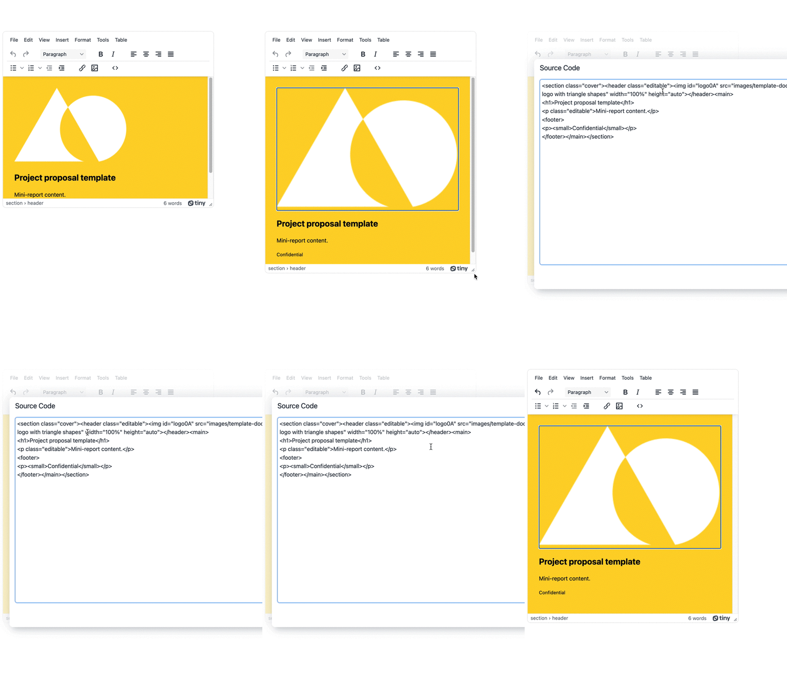
TinyMCE’s API methods resize the image with HTML attributes, and can do so in response to events such as the textarea coming into focus. It’s one example of TinyMCE’s flexibility. And it’s not only attributes: image resize with CSS is also possible, through a stylesheet.
Image resizing with CSS
When resizing images with CSS, you have more scope compared to only HTML image resizing. You could set up a separate stylesheet and configure different classes targeting images for different sizes, such as thumbnails, headers, or background images. The following examples show how image resizing with CSS works for several different outcomes.
CSS scaling images
Scaling an image when resizing images with CSS means setting properties that are designed to keep images in proportion with the content around them. Making use of the demo again, modify the TinyMCE init script to include a new section style in the content_style configuration, and take away the logo img in the middle of the document:
           content_style: `
            body {
                background-color: #fed330;
                padding: 1rem;
               }

            section {
                background-image: url("images/template-document-logo@2x.png");
                background-size: contain;
                background-repeat: no-repeat;
            }

            `,
   <textarea id="editor">
      <section class="cover">
        <header class="editable">
          <!-- <img src="images/template-document-logo@2x.png" alt="demo document logo with triangle shapes" id="logo0A"> -->
</header>The result is the background image scaled to fit the section element. The key property involved is the CSS background-size property.

CSS fit content
Fitting images to a specific container can be done with the other CSS values that work with the background-size property such as:
- Set the image to cover the background with background-size: cover
- Configure a single size for the background image (with different CSS units) with background-size: 50% , which sets the width of the image.
- Configure two size properties, which sets both the width and height.
For example, changing the content_styles property in the demo to cover resize the image with CSS to fit the section:
           section {
                background-image: url("images/template-document-logo@2x.png");
                background-repeat: no-repeat;
                background-size: cover;
            }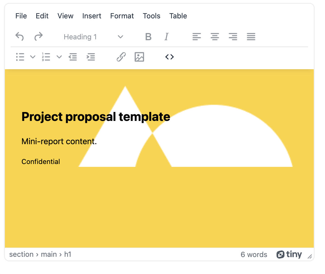
Image stretch with CSS
You can stretch an image if needed by setting the background image size height and width properties to 100%. For example, changing the configuration in the demo to stretch the background image results in the following:
           section {
                background-image: url("images/template-document-logo@2x.png");
                background-repeat: no-repeat;
                background-size: 100% 100%;
            }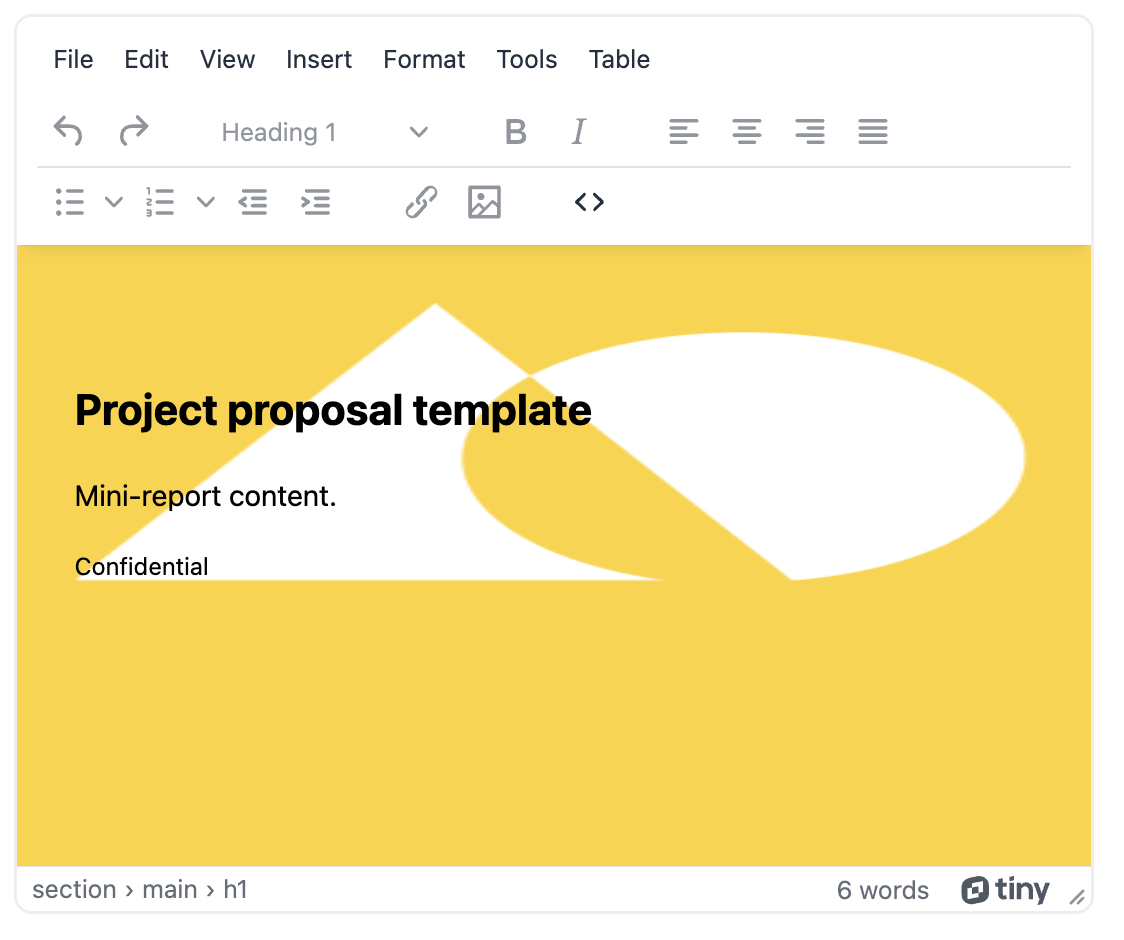
Image resizing in TinyMCE
TinyMCE’s Enhanced Image Editing (Premium) plugin provides image resizing manually. with click and drag handles directly in the TinyMCE text area. It also provides an interface for configuring an exact height and width.
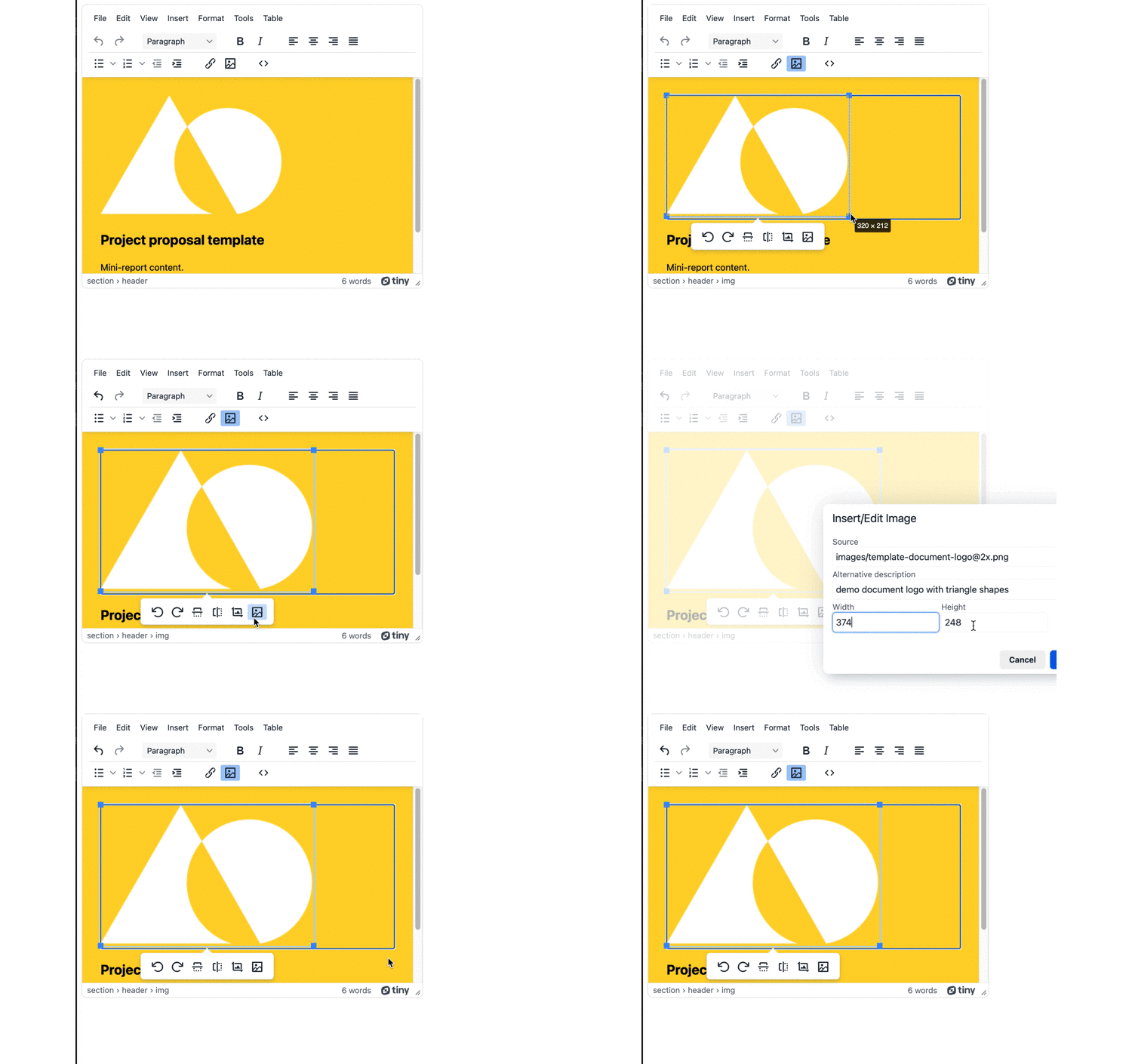
You don’t have to adjust the image size manually either: you can make use of the commands available to dynamically change the image. For example, to dynamically add a new class to an image, you can set the img attributes with addClass() and addStyle() API methods.
Best practices for image resizing
1. Resizing images with CSS
Resizing images with CSS gives content creators many different properties for adjusting image sizes to fit different needs. There are conventions that provide best practice for what sizes to use, depending on the image’s purpose within the content:
|
Purpose |
Size |
Aspect Ratio |
|
Background Image |
1920 x 1080 |
16:9 |
|
Hero Image |
1280 x 720 |
16:9 |
|
Website Banner |
205 x 250 |
1:1 |
|
Thumbnail Image |
150 x 150 |
1:1 |
2. Resizing images with HTML
When it comes to resizing images with HTML and responsive design, look closely at how the srcset and sizes attributes work. These attributes serve different images for different displays, providing different sized images to the browser, and different thresholds for the screen size. They can inform browsers to change to a different image if a threshold is reached.
Another best practice point for resizing images with HTML: setting width to 100% and the height to auto can help in regards to responsiveness, allowing the image to resize when the screen size changes.
Final thoughts on image resizing in TinyMCE
Resizing images becomes easier when conventions are set up for content creation, and then adhered to through the content creation process. Resizing images with CSS can make the process easier, with specific classes ready to be added to img elements that define the right image size for the image purpose.
If you have any questions on how TinyMCE Enhanced Image Editing (Premium) plugin can support your content development, contact us to find out more.
