Not everything is created equal… This year, we’re comparing how our TinyMCE plugins and integrations compare alongside other rich text editors. This is a question that often comes up in our testing, and by customers when trying to compare features against other rich text editors.
As such, we have launched a new, ongoing content series where we test core features, premium features, and even integrations across all the popular editors in the market to see who works best depending on the use case.
Previously, we looked at two of our most popular plugins - PowerPaste and Spell Checker Pro.
In this article, we’re taking a look at another one of our popular plugins - Accessibility Checker.
What is Accessibility Checker?
Tim Berners-Lee, W3C Director and inventor of the World Wide Web
Accessibility is essential for developers and organizations that want to create high quality websites and applications, and not exclude people from using their products and services. Writing content that is well-written, and accessible, is notoriously hard. Most content creators don’t have the experience, or knowledge, to successfully do this. It also becomes expensive and time consuming when you need to hire an accessibility expert to review all your content.
TinyMCE’s Accessibility Checker takes away this complexity and helps remove that additional cost. Our plugin enables content authors to check the content for various WCAG and Section 508 accessibility problems using a simple in-editor dialog. It also has a repair feature that steps a user through identified problems and, in many instances, automatically corrects the error on their behalf.
Which editors provide accessibility checking?
First, we looked at some of the most popular rich text editors and frameworks to identify which ones provide accessibility checking functionality out of the box. We found that only TinyMCE and CKEditor provide this type of accessibility checking.
|
TinyMCE |
CKEditor |
Froala |
Quill |
Slate |
|
|
Accessibility Checker |
✅ |
✅ |
❌ |
❌ |
❌ |
TinyMCE vs CKEditor
About the comparison
We identified nine of the most common accessibility concerns in web content:
- Headings should be marked up as headings - Headings help users with assistive technologies (like screen readers) find their way around content. If there is text in the content that is acting as a heading, it should be marked up as a heading - not simply bolded, for example.
- Headings should be applied in sequential order - Similarly, heading levels are used as a way of ensuring you’re navigating content in the right order. For example, a level 1 heading should not be followed by a level 3 heading. That has the user wondering if they’ve missed a section and can be very confusing.
- ID attributes should be unique - IDs are used by assistive technologies to associate labels with fields and can cause much confusion if they are labeled incorrectly. Often IDs are not unique as a result of copying content without updating what’s going on behind the scenes in the HTML code.
- Images should have alt text or be marked as decorative - Users who rely on assistive technologies may not be able to see images in content, so the alternative text should be provided that can be read aloud by a screen reader. However, if an image is only used for decorative purposes, the alt text attribute should be left empty - no one wants to receive more information than they have to.
- Adjacent links with the same URL should be merged - Sometimes content creators will put multiple elements with the same link next to each other. For example, one common design pattern is for an image, a heading, and a word like “More” all linking to the same destination. Any duplication of content can be noisy and should be minimized.
- Lists should be marked up as lists - Sometimes users will create a list with characters like asterisks or hyphens. These should instead be marked up as actual lists.
- Color contrast must be compliant - Some color combinations like the grey text on a white background can be difficult for people to see. Color contrast should be compliant against the standards as per this contrast checker.
- Tables should have captions - Like to section headings, captions can help users with assistive technologies decide whether they want to read it.
- Tables should have a header - Accessible tables need HTML markup that indicates header cells and data cells and defines their relationship. Assistive technologies use this information to provide context to users.
Test HTML
Based on these scenarios, we created some sample HTML, deliberately containing all nine issues:
<p><strong>This looks like a heading but is not</strong></p>
<h1 id="heading">This is an h1</h1>
<h3 id="heading">This is an h3</h3>
<p><a href="https://media.giphy.com/media/ZqlvCTNHpqrio/giphy.gif"><img src="https://media.giphy.com/media/ZqlvCTNHpqrio/giphy.gif" width="384" height="207" /></a><a href="https://media.giphy.com/media/ZqlvCTNHpqrio/giphy.gif" target="_blank" rel="noopener">gif</a></p>
<p>* List item 1</p>
<p>* List item 2</p>
<p><span style="color: #ced4d9;">Light text on light background</span></p>
<table style="border-collapse: collapse; width: 99.7245%;" border="1">
<tbody>
<tr>
<td style="width: 47.9584%;"> </td>
<td style="width: 48.0965%;"> </td>
</tr>
<tr>
<td style="width: 47.9584%;"> </td>
<td style="width: 48.0965%;"> </td>
</tr>
</tbody>
</table>Demos tested
We used the demos as provided by TinyMCE and CKEditor positioned as those used to demonstrate their accessibility checkers:
Results
|
Test |
TinyMCE |
CKEditor |
|
1. Headings should be marked up as headings |
✅ |
✅ |
|
2. Headings should be applied in sequential order |
✅ |
✅ |
|
3. ID attributes should be unique |
✅ |
❌ |
|
4. Images should have alt text or be marked as decorative |
✅ |
✅ |
|
5. Adjacent links with the same URL should be merged |
✅ |
✅ |
|
6. Lists should be marked up as lists |
✅ |
❌ |
|
7. Color contrast must be compliant |
✅ |
❌ |
|
8. Tables should have captions |
✅ |
✅ |
|
9. Tables should have a header |
✅ |
✅ |
More on image alt text
CKEditor
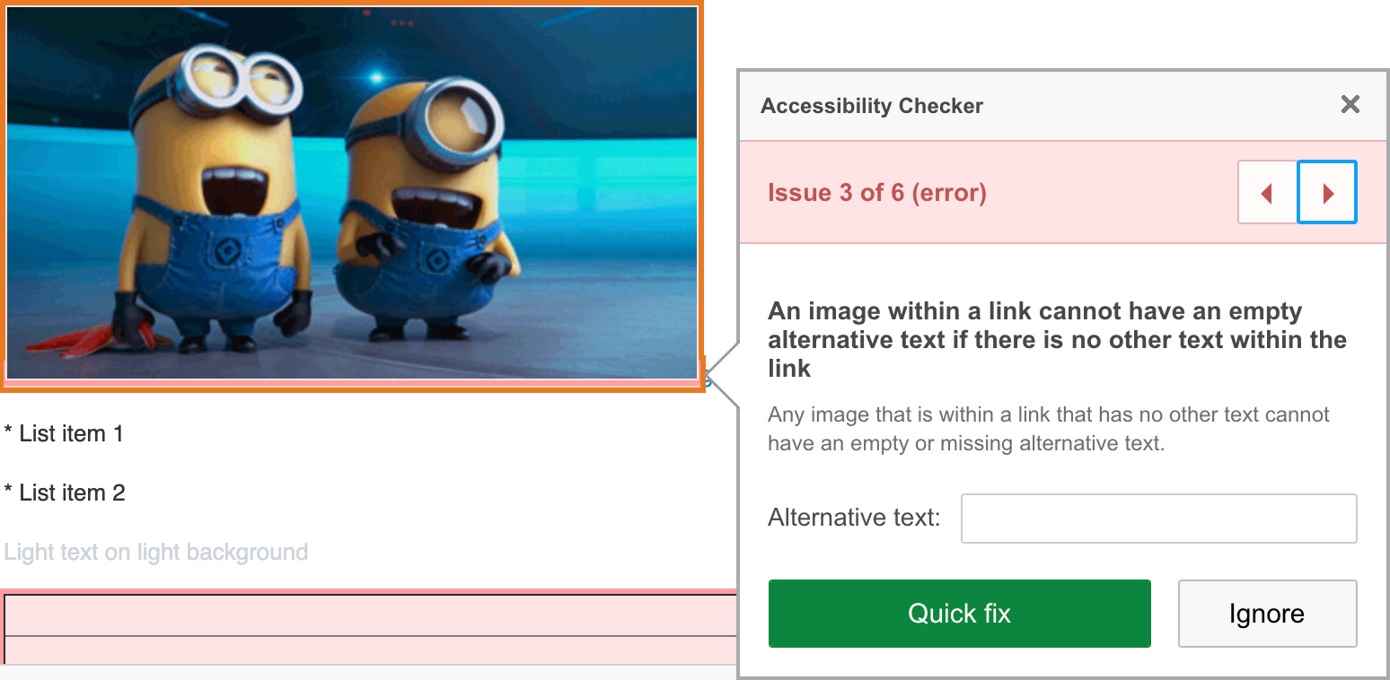
In addition to throwing an error for missing alt text on images, CKEditor throws an error if the image is also a link (see image below).
We attempted to add alternative text using the quick fix as directed; however, the alt text was added to the link, not the image, and the error remained.

CKEditor’s Accessibility Checker dialog.
TinyMCE
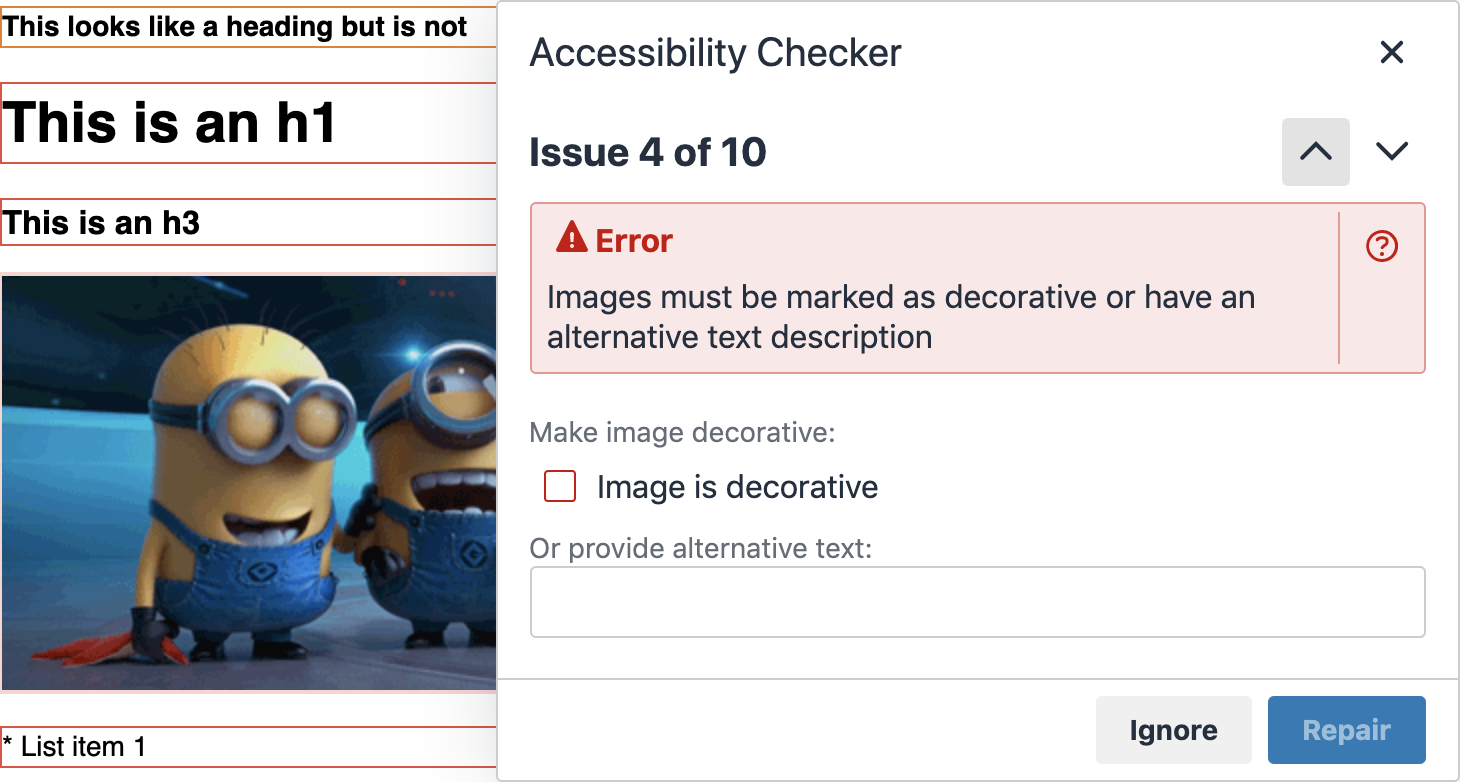
Based on our involvement in, and feedback from, the accessibility community in 2020 we redesigned our dialog for alt text on images specifically to allow users to mark an image as decorative. You can read more about our involvement in the accessibility community here.
It can be really annoying to be shown an error demanding you provide alternative text when it’s not required. Furthermore, this can lead to poor workarounds, like adding alternative text when it’s not needed, or using spaces to leave it “blank”. However, for assistive technologies to ignore the image, it really should have a null value - alt="" - as per the guidelines.
Having the option to mark images as decorative ensures the proper use of alt text in these scenarios.

TinyMCE’s Accessibility Checker dialog with the option to mark images as decorative.
Try Tiny’s Accessibility Checker
Check out our Accessibility Checker page where you can find out more about this premium feature, and run your own pressure test.
If you’ve already integrated TinyMCE as the rich text editor in your application, adding Accessibility Checker is as simple as adding the word a11ychecker to the list of plugins, and a11ycheck to the list of toolbar options in your TinyMCE configuration; for example:
tinymce.init({
  selector: "textarea",
  plugins: "advlist lists link image code media table a11ychecker",
  toolbar:
    "undo redo | styleselect | bold italic | alignleft aligncenter alignright alignjustify | bullist numlist outdent indent | link image | a11ycheck",
});
You’ll also need to make sure you have access to our premium features. Accessibility Checker is bundled with our Cloud Professional plan starting at $75 per month. The Cloud Professional plan comes with 14+ premium plugins, including our most popular PowerPaste, and other compliance features like Spell Checker Pro and Link Checker.
Start a free 14 day trial. You can also access Accessibility Checker for self-hosted solutions through our sales team.
If you’re not already using TinyMCE, consider integrating it with your applications. Get started with our quick start guide.
Contact us for more assistance or information about Accessibility Checker or how to get TinyMCE integrated with your applications for the best rich text editing experience around.
