TinyMCE 5.1 is on its way, and it’s bringing some great new UI enhancements with it. The most significant being a complete overhaul of the mobile experience, catering for the increasing trend among users to write and edit content on the move. (It’s really slick!) At the same time, we’re taking the opportunity to update the desktop UI to bring it in line with current and evolving expectations.
Version 5.1 is being released to the community next week, which means Tiny Cloud users will see the effects of this change when it’s rolled out to enterprise mid-November.
We have a commitment, not only to innovation, but also to ensure transitions like these are as seamless as possible for you and your users. So here’s an overview of the major UI changes, as well as instructions for reverting to the original defaults if required.
For full details about what’s new in 5.1, refer to the release notes (coming soon).
What’s changing?
Mobile UI
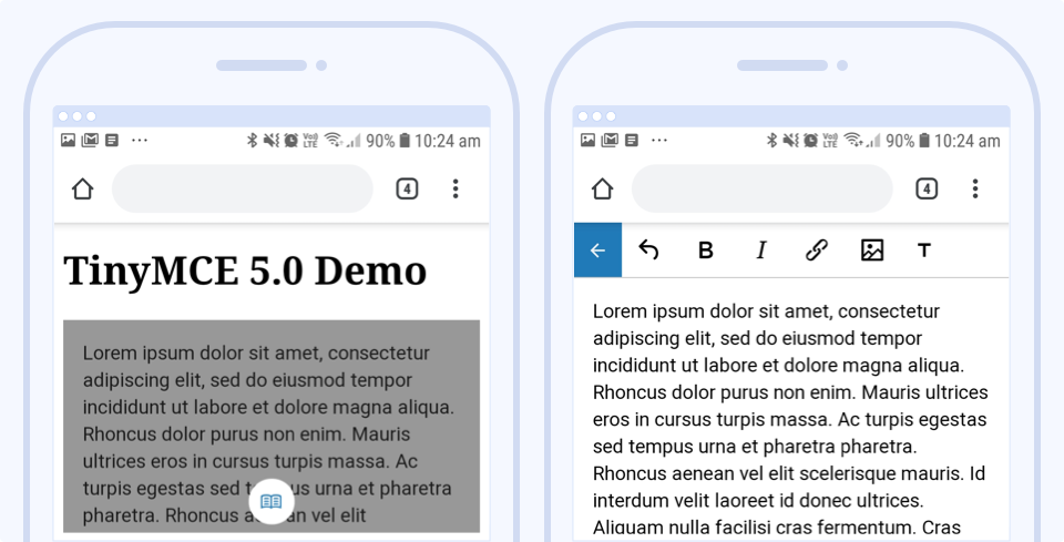
Previously: When displayed on mobile, users were presented with their content inside an inactive frame. Then, once clicked, the editor would open in full-screen mode, ready to use.

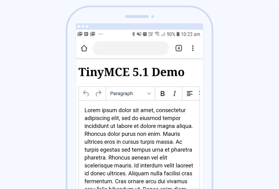
Now: The editor is immediately active within the page, and the look and feel is much improved, complete with a scrolling toolbar.

Desktop ‘more drawer’ now on by default
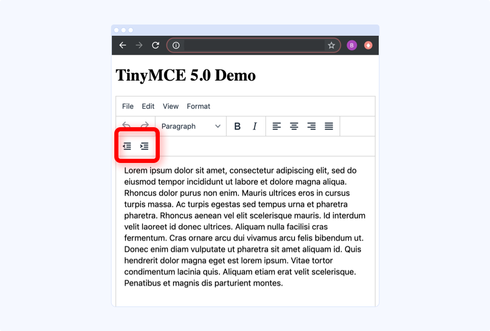
Previously: When the size of the editor window was too small to fit all of the icons on the toolbar, the default behavior was for icons to wrap onto a new toolbar row.

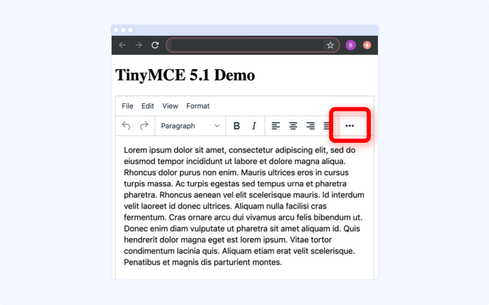
Now: The more drawer (or more icon) is on by default, and you can click it to reveal the extra options. Note, though, that this won’t apply when multiple toolbars have been configured. In this case, the more drawer will remain disabled. Refer to the documentation for more information.

Want the old UI back?
As much as we love the new UI and are confident that it’s preferred by most users, we understand you may want the option of keeping the old UI.
You can revert to the previous UI for mobile, desktop, or both by adding some simple configuration to your initialization script.
For mobile:
<code>tinymce.init({
 ...
 mobile: {
   theme: 'mobile'
 }
});</code>For desktop:
<code>tinymce.init({
 ...
 toolbar_drawer: false
});</code>In the future, we plan to remove the old ‘mobile’ theme, as the new default Tiny theme has superior mobile support out of the box.
What next?
Keep enjoying TinyMCE and the improvements brought to you in version 5.1. And if you have any questions or concerns, please don’t hesitate to reach out to us.
